Students as Readers, Authors, and Designers
Students in New York create and design a new chapter in a book.

Despite a lifetime of adult admonishment to the contrary, teens are definitely inclined to judge a book by its cover. I have found in over fifteen years of teaching that a “boring” or “uncool” cover can result in misconceptions by low or medium engagement students that last several chapters into the text. Poor cover design can even be the excuse reluctant readers are looking for to skip the reading entirely.
Even I was disappointed the new cover of Lois Lowry’s fantastic dystopian novel The Giver. After three days of non-stop whining from my lower-engagement students and vocal support on the issue from my highly engaged readers at JHS 162 in Bronx, New York, I issued a challenge.
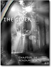
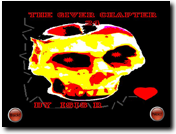
Since the ending of The Giver allows for interpretation, I wanted the kids to infer and create their own prediction of what happens by writing “Chapter 29,” a new final chapter. Students were required write about the community and the experience of Jonas after he had left and to create an appealing cover to reflect the theme and plot of their new chapter.

Students created their covers using ImageBlender, incorporating three separate images, modifying existing images, and in some cases creating an entirely new design. Students also created back covers with excerpts, incorporated poetry, and developed dedication pages. They used Share to combine all of their creative elements with the new book chapter to create and publish their own books.
I enjoyed watching my students sharing animated discussions and supporting one another as they developed images that were symbolic and reflected their themes. The specificity and depth of discussion about character, relationships and text elements would never have occurred as organically or as thoroughly without the image-based expressions of understanding the students were creating.

My reluctant readers and writers flourished, surpassing previous levels of interest and investment; my gifted students, sometimes prone to undermotivation, were equally engaged and thriving. There was not one bored or reluctant student in the group. The text came alive as they imagined and created new facets for Lowry’s world.
A former student recently shared with me that he wrote about The Giver on his Regents exam three years after being in my class. He received a high pass, and I know beyond a shadow of a doubt that the creative, interactive work he did with ImageBlender and Share indelibly etched the story into the mind of a boy who, if memory serves, was one of the top whiners that year. This lesson taught me as much as or more than it did my students…and that is saying a lot!


